Cloud Shelf is a logistics company specializing in fulfillment services through small warehouses located in urban areas, enabling faster and more efficient delivery.
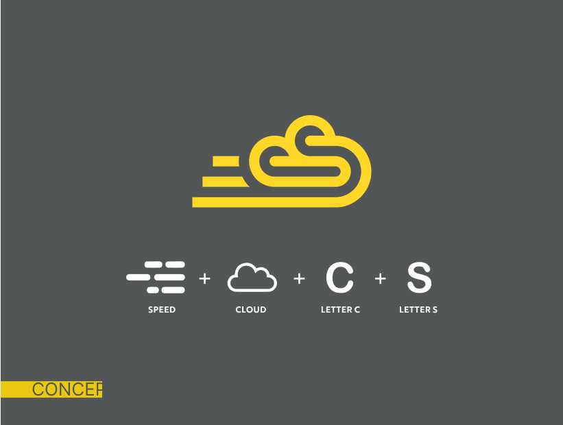
Our objective was to design a logo that embodies the brand’s core values of speed, proximity, accessibility, and simplicity while maintaining a modern aesthetic.
Thorough Briefing
Conducted a detailed session to understand the client’s vision and goals.
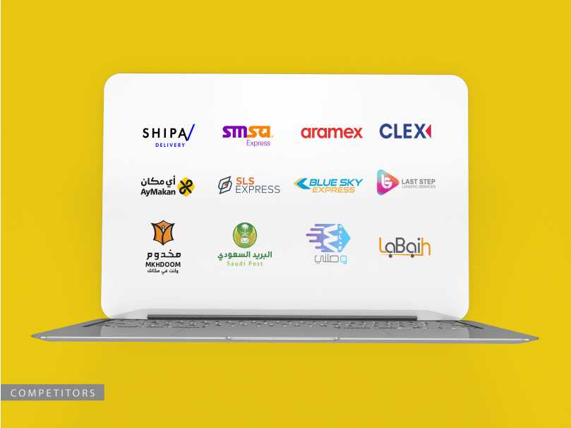
Competitor & Brand Research
Analyzed competitors and brand values to inform the design approach.
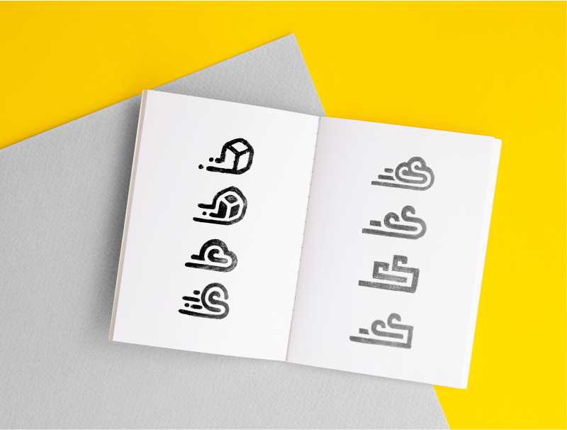
Sketching Concepts
Developed initial sketches focusing on minimalism and creativity.
Feedback Integration
Incorporated feedback through multiple rounds of revisions.
Final Design & Brand Package
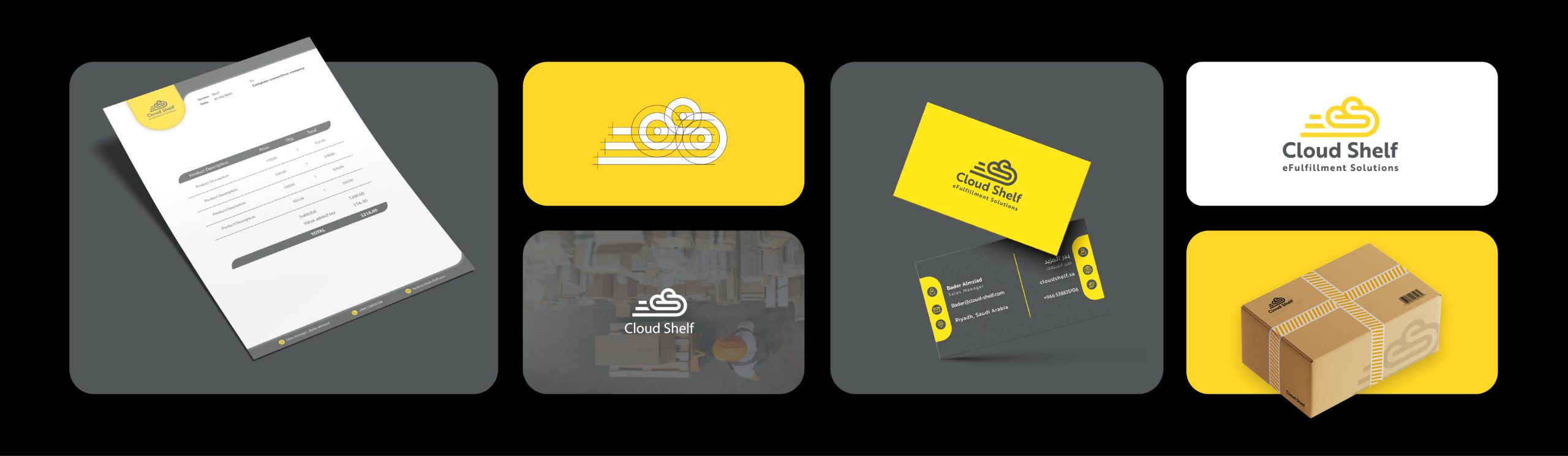
Delivered a comprehensive brand package including the logo, color palette, typography, and marketing materials.
The final logo effectively captured the essence of the brand, helping establish its unique identity in the market. The client expressed high satisfaction with the design.
By focusing on clarity and simplicity, we ensured users could access data and profiles with minimal effort, enhancing the overall experience.
The design enables effortless communication and decision-making, fostering stronger, more productive brand-influencer collaborations.
Key Design Highlights
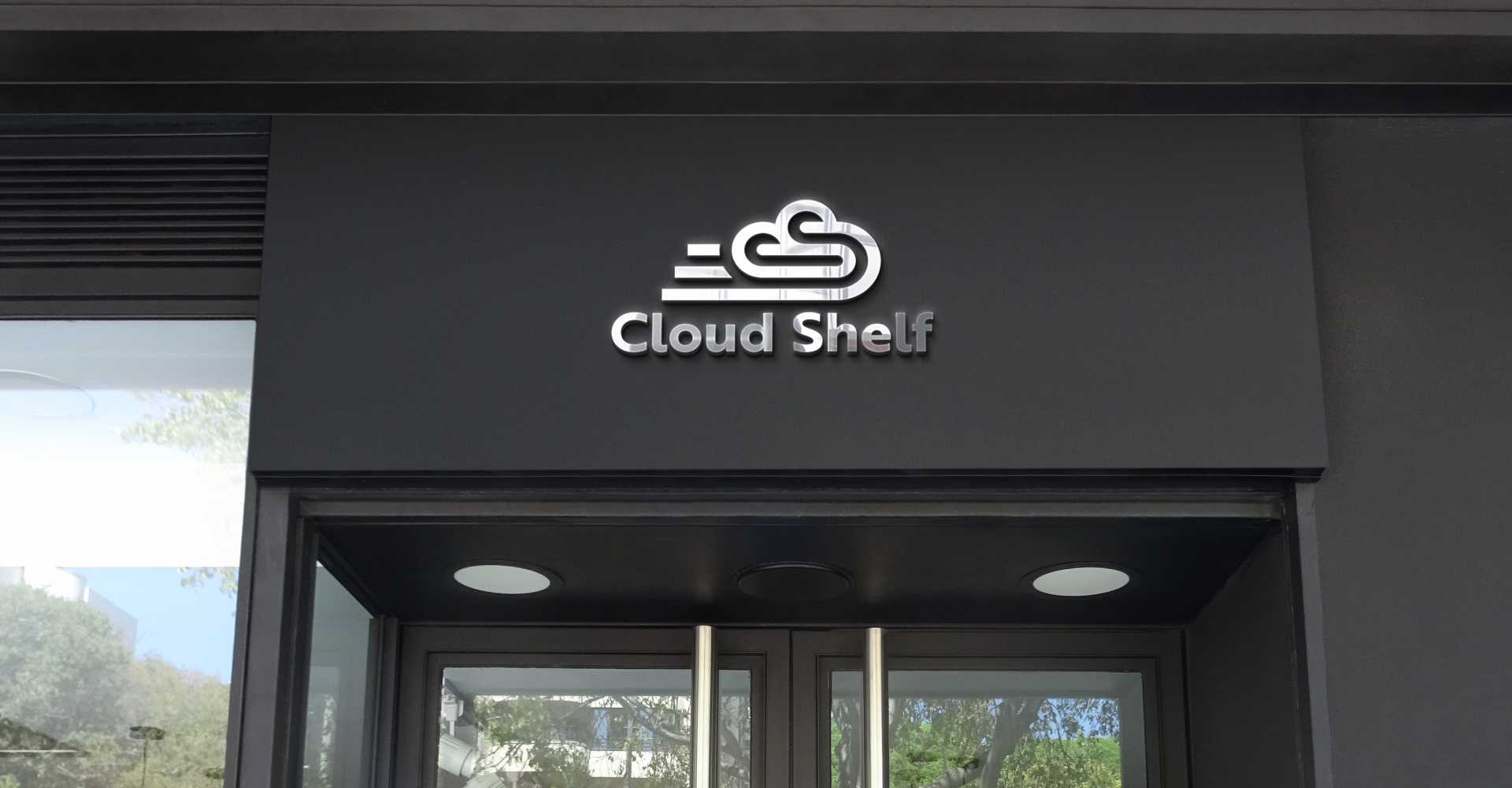
Capturing Brand Identity
The logo creatively represents Cloud Shelf’s core values.
Modern Aesthetic
Achieved through a minimalist design approach.
Effective Use of Negative Space
Incorporated for a visually striking representation.
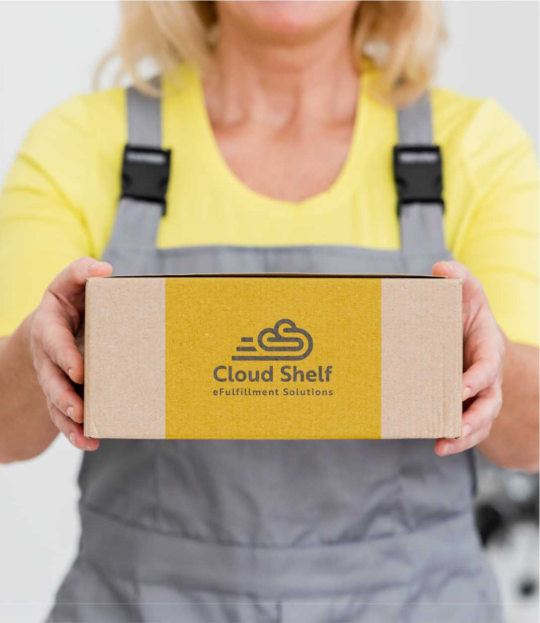
Comprehensive Brand Package
Provided for consistent branding across all platforms.
High Client Satisfaction
The design resonated well with the client’s vision and goals.