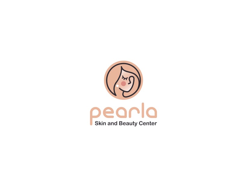
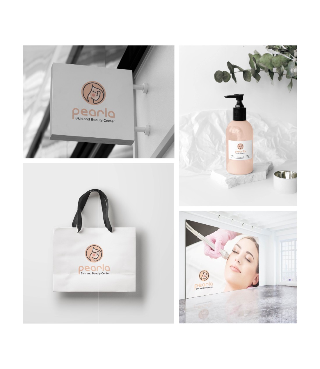
We designed a unique mascot logo for Pearla, a beauty center specializing in facial cleansing. The logo features a mascot wearing a pearl earring to symbolize the center’s name and expertise.
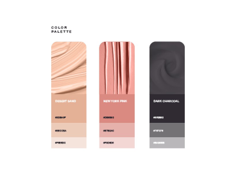
Warm, comforting colors were selected to represent healthy, glowing skin, while the design maintained a balance of sophistication and charm.
Brand Identity & Market Analysis
Conducted an in-depth analysis of the beauty center’s brand identity and market.
Mascot Concept Sketches
Created initial sketches to develop the mascot concept centered on beauty and skincare.
Design Refinement
Refined the design by incorporating feedback and adjusting colors, typography, and illustration details.
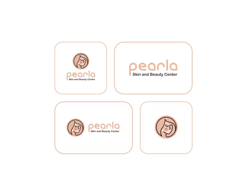
Versatile Logo Creation
Developed a versatile logo for use on social media, products, and promotional materials.
Final Branding Delivery
Delivered final branding assets, ensuring consistency across all customer touchpoints.
The logo resonated with the target audience, enhancing the beauty center’s brand presence and helping to establish its identity in the skincare market.
By focusing on clarity and simplicity, we ensured users could access data and profiles with minimal effort, enhancing the overall experience.
The design enables effortless communication and decision-making, fostering stronger, more productive brand-influencer collaborations.
Key Design Highlights
Unique Mascot Design
Created a memorable mascot that represents the brand’s core service.
Visual Appeal
Warm colors and elegant illustration evoked a sense of comfort and relaxation.
Brand Identity
Successfully merged beauty and expertise into a cohesive visual identity.
Versatility
The logo was designed for cross-platform use, from social media to product packaging.
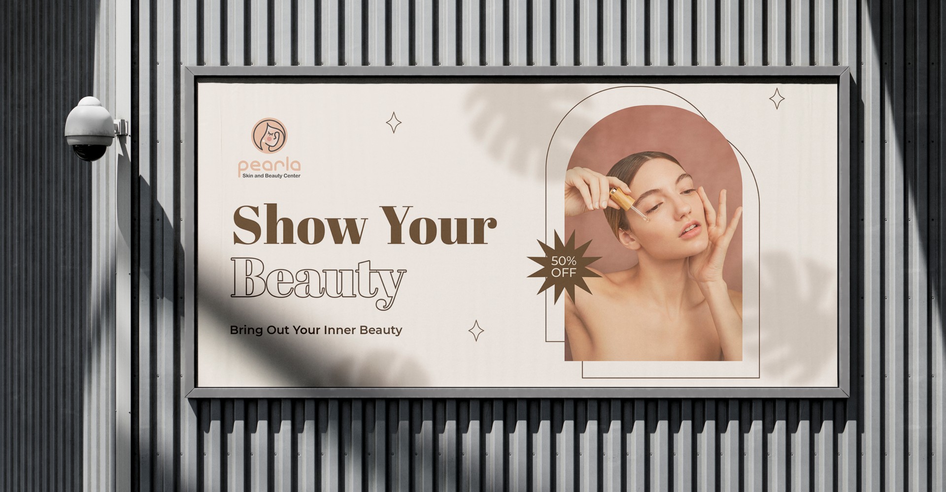
Customer Engagement
The logo design helped the center enhance its customer engagement through consistent and appealing visuals.